
There are a lot more opportunities for property investors than there used to be.
“If only I’d bought ten years ago!”
How many times have you heard that? (Me, I’ve heard it a dozen times year for the past twenty years!)
It’s also pointing to a particular investment style I don’t find particularly inspiring – trying to back the next winner, pick the next boom-town suburb.
You can make money, definitely, but you’re taking a bit of a gamble. You’re relying on the market doing what you want in the time frame you want.
Nothing wrong with that. Often, you can see the writing on the wall, and position yourself nicely for lift-off.
But there are also more methodical ways to make money – methods that don’t leave anything to chance. Yes, they’re a bit more sophisticated, but they’re not rocket medicine. Anyone can do it.
And if you can lock in double-digit returns, why wouldn’t you.
Anyway, I saw this chart from CoreLogic the other day, and I thought it said a lot about how much opportunity there still is in the market, and why.
This is the chart here. It looks at the distribution of Melbourne house prices – How many cost $500K, how many cost $600K and so on. And it compares the current distribution to the past.
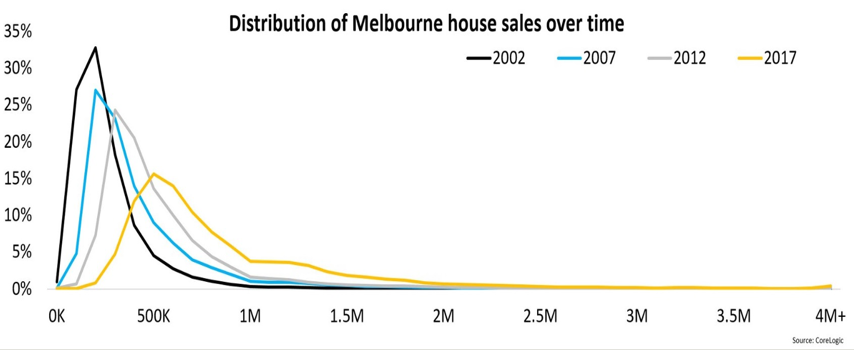 So the black line is 2002. The gold line is 2017.
Now, what do you notice?
Well, the first thing to notice is that the distribution is drifting to the right. That means that prices are getting more expensive. The middle of the distribution was about $250,000 in 2002. It now looks like it’s about $500K.
No surprises there.
But what else do you notice?
The thing that jumps out at you is that the distribution is getting flatter. The peak is a lot lower. The curve is wider.
Now, what does that mean?
Well, what it means is that there’s a lot more variety in the market these days.
So back in 2002, prices were pretty tightly bunched around $250K. That meant that houses in Melbourne were fairly similar across suburbs (though obviously there were outlier suburbs too).
Eyeballing it, it looks like about 75% of the market was priced between $200K and $300K back then.
Fast forward 15 years, and we’re looking at a much flatter distribution. That means there’s a lot more variety in house prices – much more spread.
Again, eyeballing it, it looks like there’s only about 45% of the market between $400K and $700K.
So it’s a very different market.
I mean, if it was simply a matter of house price inflation, with no change in the structure of the market, all we’d see is that distribution curve shift right. We wouldn’t see the shape of the curve itself change.
But it has. And that tells us that there’s a lot more variety in the market. That’s good for investors for a couple of reasons.
First, there’s going to be something available at your price point. There’s still something for everybody, (assuming you can at least afford the $300K it takes to get a seat at the table.)
Second, the market is more dynamic. There’s more variety between suburbs, but also within suburbs.
That gives investors a lot to work with. If you can find a cheapie you want to do up, there’s a lot of examples of premium properties you can reference and pitch too.
I mean, imagine taking a $300K house and reno’ing it and trying to sell it for $700K back in 2002. You’d be taking it from entry level to beyond premium.
Today, the same uplift is totally conceivable. You’re simply taking it from entry level to middle of the road.
No one would bat an eyelid if you stuck a $700K price tag on it – so long as it met the standard.
So the price range is really the play-pen within which investors play. The wider the range is, the more room we have to play, the more fun we have.
So yeah, still worlds of opportunity on offer.
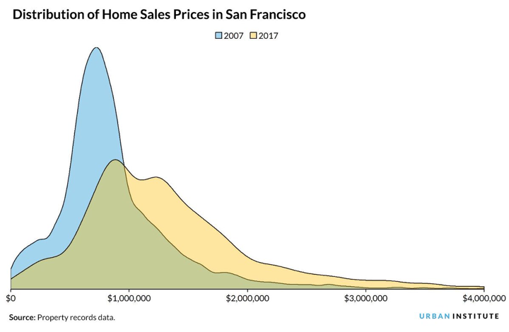
Ps – when I was researching this, I came across a chart that showed that the same thing had happened in San Francisco – that flattening of the distribution.
 Interesting, hey?