I wanted to look today at one of the strangest features of the Australian property market, but also one of the most important to understand – the housing shortage.
Perhaps more than any other factor, the growing shortage of housing explains why house prices keep rising, year after year.
It’s absolutely fundamental to our understanding of how the property market works.
And guys, this is a little techy, but trust me, if you got across the principals of asset protection, if you got your head the ins and outs of finance and all that, you can get this.
To start with, we’ve got to go back to Economics 101. Economics training teaches you a lot of useful things (and a lot of gumpf!) but one of the key ideas that’s stuck with me is ‘it’s all relative’.
Remember that.
The key idea is that information only becomes meaningful when you compare it to something.
For example, what if I told you that a two bedroom unit in Shanghai costs RMB$2.5m. (It does.) How much does that mean to you?
If you’re like most folk, probably nothing. To understand what that number means, we have to compare it to something.
For example, how much is it relative to what the average person living in Shanghai earns? Or how much is it relative to say a car, or a year’s worth of groceries?
Or how much is it relative to a house in Australia, after we convert the currency?
The “relativities” make the information meaningful and useful.
Ok, hold that thought in your head. I’ll come back to it. Let’s get back to this whole housing shortage thing.
Ok, first up, have a look at this chart here. This is the number of new buildings approved every month, going back to 1984. I’ve smoothed the series myself, so you can see the trends a bit more clearly.
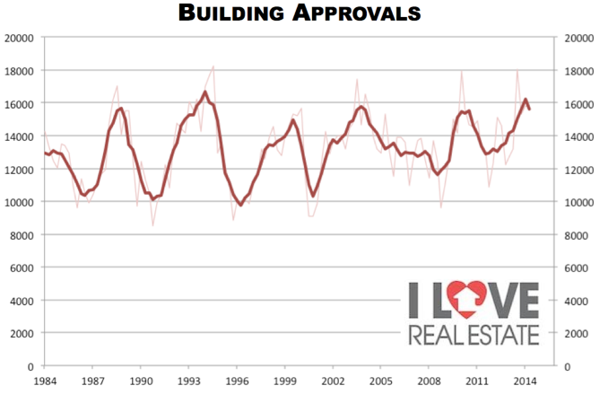
Ok, what jumps out at you here?
The first thing is the cyclical nature of building approvals. Up and down it goes, hand in hand with our economic fortunes.
The second thing that should jump out at you is that this series, if you were to put a trend line though it, is pretty flat. The average number of monthly approvals over the past 5 years is pretty much the same as the average for the 5 years from 1985 to 1990.
It cycles up and down, but you wouldn’t really say that it’s been increasing over time.
The third thing to note is that over the last year or so, it’s spiked. Home-building has really taken off. We’ve even broken records set in the late 80s and mid-90s housing booms.
So, what does that mean?
Well, some people have said that this means the current surge in prices is coming to an end. Alan Kohler was even on the ABC news saying that this chart means that the boom is over.
Why?
Supply and demand. Back to Economics 101 again, if the supply of something increases, other things being equal, there’s more of that good on the market, buyers can be a bit more choosy, and sellers have to start competing on price. Prices come down.
So if the supply of housing goes up, prices must start coming down, right?
Wrong.
This is why.
At the same time as supply is changing, demand is also changing. You can’t look at one and ignore the other.
And so to understand what the construction boom means for the market, we need to look at supply relative to demand.
Remember, the relativities matter.
Well, ok, so how do we do that?
Well demand isn’t quite as clear-cut as supply, because people can stay at home with mum and dad longer and so on, but to get a rough feel, I like to use the population data.
It’s people who demand houses, so how many people are there?
Well, we know that the Australian population continues to grow, and thanks to a surge in immigration in recent years, it’s grown very strongly over the past ten years or so.
So demand is increasing too.
So how do we balance supply and demand off against each other?
That’s what I’ve done in this chart here. This is what I call the ‘construction rate’. What it does is divide the number of new homes by the population, so what you’re looking at here is the number of new homes per million people living in Australia.

Now this changes the story in a big way.
First up, we can still see the same cycles as before, but now, instead of being flat, we can see that this series is actually trending down over time. So while we built around 800 homes per million people in 1984, we only built around 600 homes per million in 2013.
And while there has been some upward movement in recent times, our construction rate is still very ordinary by historical standards.
Less than 700. It was up around 1000 in 1988 and 1994.
Supply is still not keeping up with demand. It gets worse every year.
And this is one of the key factors driving a long-run upward trend in Australian house prices.
Got it?
Remember that next time someone on the news tries to tell you that this construction boom means the price boom is over.
Tell them it’s all relative.